Workflows can now pause mid-run and route to a person for a decision. Human Approval supports two flows: approval requests that default to the current user, and task assignments that can go to a specific person, role, or dynamically resolved reviewer. Once the reviewer acts, the run resumes automatically.
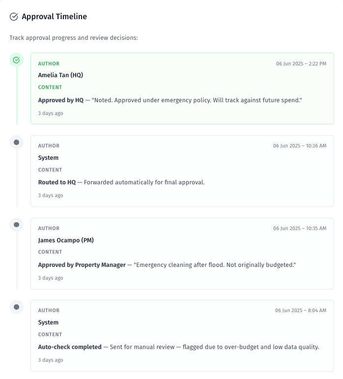
A paused run shows as a distinct amber "action required" state, both on the canvas node and in the nav bar, so it never reads as a failure. Reviewers see a dedicated review surface with the run context they need, and can approve or reject to route the run down the corresponding path.
The Loop Container node now supports expand and collapse, auto layout for member nodes inside the body, resizing, and drag-based membership. During a run, the container border reflects status (green for success, red for error, amber for warning) and the header shows a live iteration count. Dragging the container moves all members together, and it renders correctly behind them in the stacking order.
Form fields can now connect to a live data source, whether an internal table, an external database, or an API integration, through a single picker used across both dropdown fields and data tables. The same configuration surface works regardless of source type.
Data table columns support four rule types (column conditions, formulas, duplicates/uniqueness, and color scales), each with its own style controls: bold, italic, underline, strikethrough, color pickers, and a color-scale panel. Rules can target specific columns via an applyTo scope, and the rule list flags shadowed rules and shows live match counts as you edit.
Form Studio now generates barcodes and QR codes from form data, with configurable symbology, download and print output, and a two-tab inspector for setup and actions. A value-change action can trigger regeneration at runtime, and generated codes render through a dedicated display component with built-in validation.
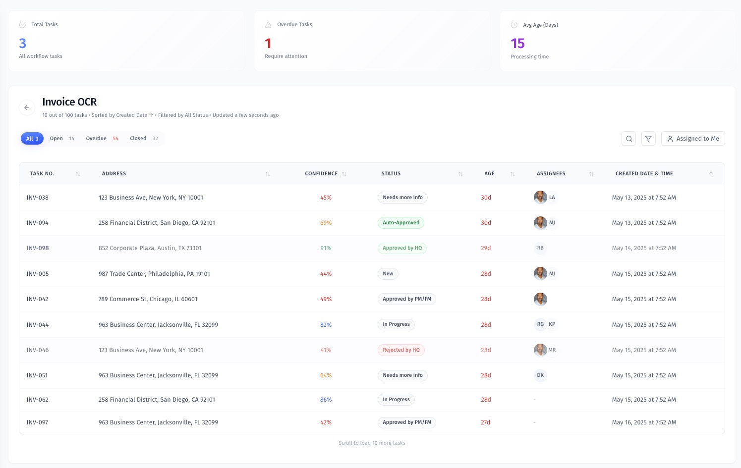
Table and line-item fields extracted via OCR now highlight the source region on the original document, making it easier to verify extracted values against the page they came from.
Analytics (non-full portal view) now has an auto-refresh button.
Ephemeral environments are available for testing changes in isolation before they reach production.
Form Studio gains improved offline capability.
The mobile app supports Expo OTA updates, allowing smaller fixes to ship without an app store release.
Flow run errors can now trigger Google Chat notifications, configurable per organization.
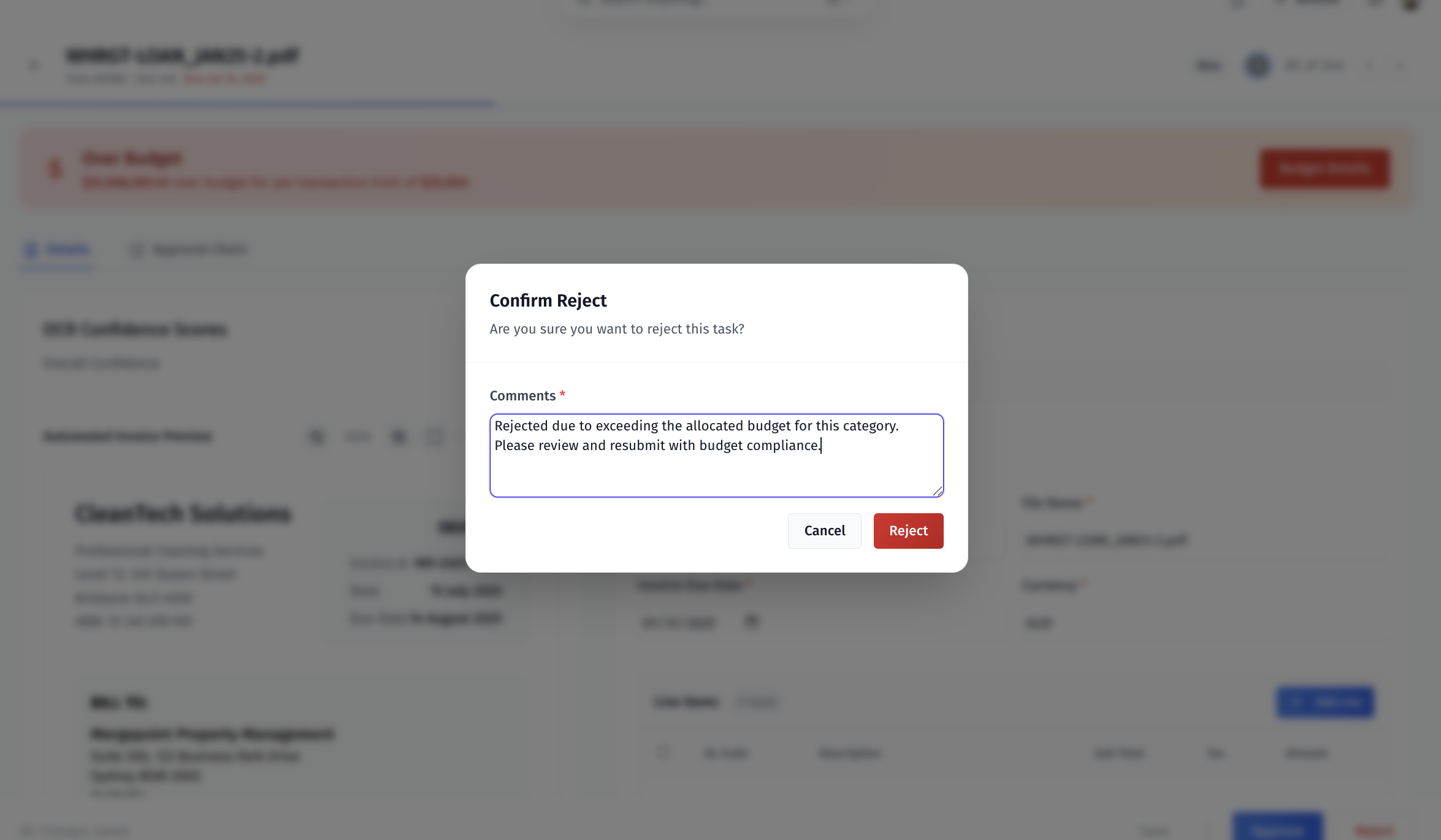
Localization coverage expanded across the HIL Tasks page and mobile app: task record header actions (Approve, Reject, Reopen, Delete) are now translated, native language names display correctly in the mobile language list, and locale-aware dates are in place. User-generated task names and comments intentionally stay in their original language.
Fixed an error that blocked pausing a workflow that wasn't currently running.
Fixed a task configuration lookup failure caused by a missing record reference.
Resolved slow production database queries through Prisma query optimization.
Fixed a WhatsApp integration error when the media URL couldn't be retrieved due to permissions or an invalid object ID.
Fixed a validation error caused by unresolved upstream node references.
Fixed an issue in Form Studio that prevented editing the base container.
Fixed intermittent GraphQL network errors in the Supabase write and query nodes.
Fixed document ingestion failures caused by a missing primary key field, a missing incremental cursor field, and insufficient permissions.
Sixteen upgrades shipped this cycle, spanning access, workflows, forms, tasks, and mobile. The highlights are below.
A workspace with one flat permission level means every new hire either gets too much access or has to wait on an admin for each new tool they need. Permission sets fix that by shaping the whole workspace around what each person actually does. Give an end user Tasks and Analytics and that's exactly what they get: a focused "Let's get started" home with a trimmed rail and no clutter. Grant a builder more — Mergebase, Workflow, and Agents alongside — and their workspace expands to match. People land in an experience sized to their role from day one, and teams get an enterprise-grade layer of control over who can reach what.
Copying the same list of statuses, regions, or tax rates into field after field means a single change has to be made in a dozen places — and inevitably, one gets missed. Workflows can now define named values, calculations, and option lists once at the workflow level, available to every form field and node from there on. A variable can change as the workflow runs or be locked as a constant, with support for seven data types and multi-value lists.
Select Options extends the same idea to dropdowns and multi-selects: build a named list from a table, a data collection, or an existing field, then share it across multiple fields on a form, each filtering it independently. Define a value once and reuse it everywhere instead of maintaining copies.
A workflow that fails silently — or dies with a stack trace nobody but an engineer can read — leaves whoever's watching it with no idea what to do next. Workflows now catch problems earlier and fail more gracefully. Structural issues are flagged before a run even starts, and node-level errors surface right on the node with a clear inspector banner: a plain-language heading, the message, and technical detail on demand. Failures are typed — connection and auth, integration and API, AI node, timeout, permission and quota, and runtime — so each one comes with the right response: transient errors retry automatically, while the rest fail fast with guided recovery actions like Retry, Reconnect, Fix with Agent, Go to setting, or Contact admin. A run no longer stops silently; it tells you exactly what broke and how to fix it.
Debugging a run used to mean leaving the builder for a fullscreen dialog, losing your place on the canvas in the process. Run history now lives in a dedicated right pane instead. Every run carries a status badge with a hover tooltip, and live runs stream their steps in real time with a running spinner. Expand any step to inspect its input, output, and error detail, or click it to focus the matching node on the canvas. Nested workflows open in a subflow drill-in, and lifecycle actions — Replay, Refresh, End — appear only when they apply to the run's current state. Watching and debugging a run now happens in one place, without ever leaving the builder.
Getting a document signed used to mean sending someone out of MergePoint entirely, into a separate e-signature tool, and hoping the result made it back into the right task. Tasks can now send DocuSign templates directly. Connect an account via OAuth, choose a template from a picker, and MergePoint auto-fetches its recipient roles, date tabs, and text tabs straight from the DocuSign API. Recipient email, name, and signing mode are editable per role, with chevrons to reorder the signing sequence. Signature approvals stay inside the task instead of moving to a separate tool.
Turning a sample document into a form schema has always meant reading it line by line and typing every field in by hand. Point the field extractor at a document instead and it reads the file for you. Upload one or more PDFs and MergePoint renders each with zoom and page navigation while it analyzes — the page blurs during analysis and snaps crisp when its result lands. Extracted fields arrive in two groups, already in your schema and new suggestions, each showing a preview of the sample value it found. Select what you want with per-field checkboxes or Select all, then apply them in one step. Building a schema from a real document takes seconds instead of manual transcription.
A form that needs a real signature has always meant routing the signer out to a separate e-signature tool and back. Forms can now capture a signature directly, inline. One component covers three ways to sign: draw it by hand with a mouse, stylus, or finger; type a name and render it in a signature-style script; or leave it empty until the signer is ready. Both captured states show the same "Signature captured" confirmation, so the field behaves consistently no matter how someone signs. Signatures export as an image on submission, work fully offline, and the typed mode stays keyboard- and screen-reader-friendly for anyone who can't draw with a pointer.
A single rigid upload widget rarely fits every situation — evidence photos on a job site need a different flow than attaching a signed PDF at a desk. File upload fields get a full overhaul to match: file-picker or adaptive capture mode, and list, chips, or gallery display, with configurable height and max file count. Chips show thumbnails and upload progress; gallery view adds a lightbox with touch support, drag-to-reorder, and a live camera capture mode. Mobile splits uploads into separate "Select photos" and "Select files" actions, so capturing evidence from a phone matches how people actually use one.
Instructions and summaries written as static text go stale the moment the data behind them changes — a hardcoded "Order #1234" never updates once the real order number is known. Rich text fields now support inline data bindings so that text can read real values instead. Trigger the binding picker with @, format text with a floating selection toolbar, and insert bindings as chips that resolve to live values in preview and submission. Broken bindings are flagged automatically, and the inspector adds height, background color, and border controls. Instructions and summaries can now read back real record data instead of a static placeholder.
Date entry, time entry, and date ranges used to mean reaching for three different components and stitching their validation together by hand. A new date and time field covers all three from a single component. Pick from a calendar popover with an adaptive grid, set time down to the second in 12- or 24-hour context, and jump with Today/Now or clear in a tap. Validation supports future-only, past-only, explicit ranges, and formulas, and a date range can link two fields with cross-field checks. Defaults can be static, bound to data, or computed by formula, and a built-in duration engine formats elapsed time for display.
A form or detail view that always opens by navigating away breaks whatever context the person was just looking at. Forms and content can now open in an overlay instead — a centered modal, a side slideout, or an anchored dropdown — each with its own configuration for backdrop, alignment, max height, and gesture behavior. Actions and record views can surface in context without navigating away, so a task or form stays in view while a related detail opens on top of it.
Sharing the "same" form with different teams or partners used to mean maintaining near-duplicate copies just to pre-fill a different default. Forms can now declare URL parameters in Settings and bind their defaults to system or session fields. Values resolve in priority order — URL value, bound default, static default — and flow through shared links, embed codes, and {{param:name|fallback}} tokens in field text, with captured values stored on submission. One form can be pre-filled and reused across many contexts from the link alone.
Writing a formula used to mean knowing — and typing — the exact internal ID behind every field, with no way to double-check you had the right one. The formula editor now gets an inline field picker: type @ or use the binding button to search fields by name, filtered by expected type when relevant. Picked fields insert as {{binding_path}} tokens, or as raw member access in JavaScript mode, and render as chips that flag stale or broken references. Building a formula no longer means remembering exact field IDs.
Working a queue of tasks one at a time, with no memory of where you left off or what's already open, wastes time re-finding your place after every click. The task list now gets a resizable, collapsible left pane with time-grouped buckets, quick filters, and persistent layout state. Open tasks behave like browser tabs — click a card to open one, reuse the tab if it's already open, and auto-close with advance-to-next on resolution. Working through a queue stays fast and keeps its place.
Fieldwork doesn't pause for a bad signal, but until now MergePoint mobile did. MergePoint mobile now works fully offline. Choose which tables sync via Mergebase, configure auto-insert of form values into Mergebase on submit, and rely on background sync to pull remote records and push pending local changes once reconnected. Fieldwork continues without a signal and catches up on its own the moment connectivity returns.
A form or app that only speaks one language quietly turns away every respondent who doesn't read it — or forces them through a translation they didn't ask for. MergePoint now supports multiple languages across forms and the mobile app, so the same form can be filled out correctly in the languages your customers actually use. Set the languages your organization supports once, let individual accounts or forms narrow that down further, and translate content on demand with AI instead of managing translation files by hand. Drift detection flags content that's changed since it was last translated, and an author review panel keeps a human in the loop before a translation goes live. Desktop and mobile web platform UI (the app's own chrome, not your form content) stays in English for now; locale pickers flag any language a form doesn't yet support, and content without a translation falls back to its original text rather than showing a blank field.
Fixes from this cycle are tracked in their individual feature changelogs.
A global team shouldn't have to solve "which languages do we support" separately for the mobile app and for every individual form. Pick the languages your organization operates in once, in Workspace Settings, and that choice becomes the shared pool every form author and every teammate's account picks from — no more guessing which languages are "allowed" or juggling a different list per surface.
From there, form authors add any of those workspace languages to a specific form and generate AI translations for every field, label, and message with one click — no duplicate forms, no separate versions to keep in sync. Respondents get a language picker the moment the form loads and can switch anytime; when you edit the English source later, the translation review queue picks up the change automatically, so nothing quietly goes stale. Teammates get the same benefit for their own account — their personal language setting is drawn from the same workspace list, so it's always a language your org actually supports.
The File Upload component now supports chip and gallery display styles, with a size scale (S/M/L/XL) to control how images appear in the gallery view. A ghost-cell affordance makes it clear where to add new files, and uploaded images can be reordered by dragging them into place.
Gallery images open in a full-screen lightbox for closer inspection, and a new image fit control lets you choose how images are cropped within their cells. On mobile, uploads now use a two-button pattern for capturing or selecting files.
PDF documents now render directly inside forms. Users can view uploaded files alongside AI-highlighted extraction regions, making it easier to cross-reference document content with the fields being filled in.
A new panel lets you browse fields from connected tables, workflow steps, and global variables, then drag them directly onto the form canvas. This removes the need for manual field mapping when building task forms.

Date and time input consolidates into a single palette entry. One component now handles date, date+time, time-only, and duration display, replacing the need to pick between separate field types.
It supports 14 built-in date formats plus custom patterns, date ranges, and formula-based validation, so date logic can live directly on the field instead of in a workaround.
Add labeled or plain horizontal separators to break a form into clearly defined sections. Divider labels support full text styling — color, size, weight, and alignment — for cleaner, more structured layouts.
Pick any form field directly from inside a formula. Conditions, defaults, and calculations can now reference live field data without leaving the formula editor.
Fixed a bug where temporal activities stayed stuck in a pending state when the return result was too large.
Fixed an error that caused object generation to fail unexpectedly.
Form Studio fields now share a single formula engine, used consistently for pre-filled values, conditional logic, and every other formula-driven behavior across the product. Building this once means formulas behave the same way everywhere, regardless of which field or surface they're used in.
Two capabilities ship on top of this engine. Default Value lets you pre-fill any field — including dropdowns — with a formula that ranges from a simple calculation to conditional logic based on other answers. Visibility and Conditional Disable let you show, hide, or lock a field based on what the user has already entered, with logic that updates live as the form changes.
Fields can now react to what a user enters. Formulas also drive default values. Pre-fill a field with anything from a simple calculation to conditional logic based on other fields, across every input type including dropdowns.
Fields can now react to what a user has entered elsewhere in the form. Use formulas to show or hide any field, or to control whether it's editable, with logic that updates live as answers change.
Formulas also work for default values — pre-fill a field with a simple calculation or logic conditioned on other answers. This applies across every input type, including dropdowns.
Resolved an issue where certain workflow activities stayed stuck in a pending state due to oversized return results.
Fixed an error that could prevent object generation from completing.
The workflow builder now includes a persistent right-pane run inspector. Resize it to fit your workflow, browse past runs, and drill into any run to see step-by-step execution detail without leaving the canvas.
Selecting a step in the run history focuses the corresponding node on the canvas, so you can trace execution against your workflow's structure. The panel also drives the run lifecycle directly and displays a full set of run-status badges, giving a clearer read on what succeeded, failed, or is still in progress.
Run visibility now lives in a resizable right-hand panel inside the workflow builder, so you can inspect executions without losing your place on the canvas.
List view — every run for the current workflow, with trigger source, timestamp, and status (Running, Success, Failed, Action required)
Detail view — drill into a single run to see its step-by-step trace; selecting a step focuses the matching node on the canvas
Step inspector — view input and output for any step to debug exactly where and why a run failed
Live mode — runs in progress update in real time as each step executes, no manual refresh needed
Run lifecycle controls — replay a run, refresh its status, or end it in progress, directly from the panel
Status taxonomy — a consistent set of states (Running, Success, Failed, Action required) used across the list, detail, and canvas so a run's state always reads the same way everywhere
The result is one place to answer "what happened on this run" — without leaving the builder or piecing it together from logs.
Define named values, calculations, and option lists once and reuse them across every form field and node in a workflow.
Seven data types — Text, Number, Date, Boolean, Options list, Formula, and Constant, covering everything from a single value to a computed expression
Variable vs. Constant — a Variable can be updated as the workflow runs (e.g. via a Set Variable node); a Constant is locked at creation and never changes mid-run
Formula variables — compute a value from other variables or form fields, recalculated automatically whenever an input changes
Set Variable node — update a variable's value from anywhere in a workflow, so state can flow between steps without threading it through every node manually
Available everywhere — every variable is exposed to the Data Binding Popover under its own namespace, so any bindable field in Form Studio can reference it alongside form fields and node outputs
Search & count badge — the variables panel shows a live count and lets you search by name as the list grows
One consistent place to hold workflow-wide state, instead of re-deriving the same value in multiple places.